Dave Premium Spices
Branding | Packagind Design | Adaptation | Brand Assets

Share if you liked it!
Salted Elegance: Redefining Tradition with Innovative Packaging
Dave Masale’s Kala and Sendha Namak (Black Salt and Rock Salt) are traditional spices often associated with conventional packaging designs. The challenge with us was to breaking away from this traditional perception and create a packaging design that appealed to the modern consumers while retaining the essence of the product.
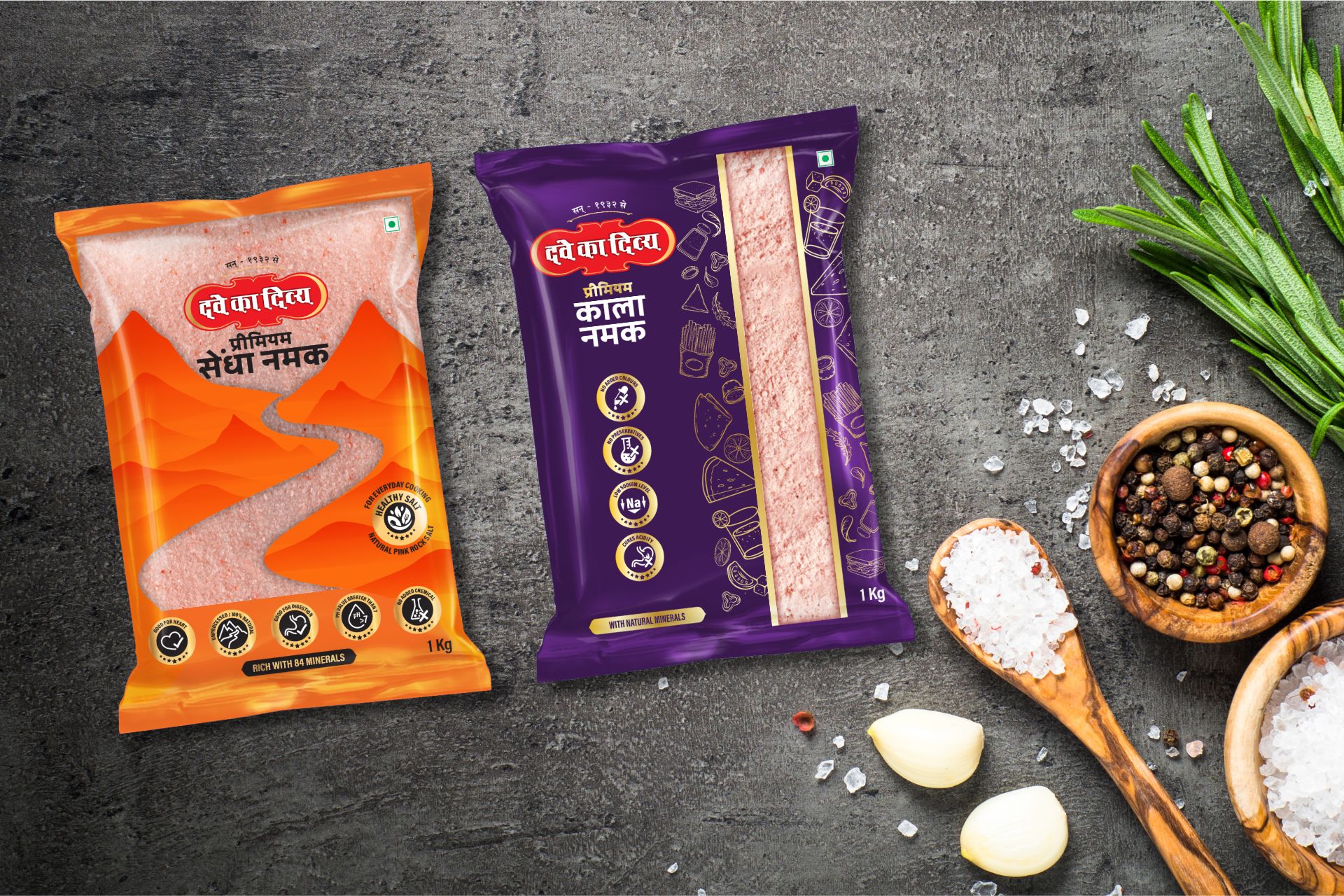
One of the key challenges was to ensure that consumers could clearly see the product inside the packaging. Both Kala and Sendha Namak have distinctive textures and colors that can be visually appealing, but conventional packaging often obscured this aspect. Thus, the challenge was to incorporate a see-through window that was large enough to showcase the product effectively.
To address the challenge of traditional perception, we revamped the packaging design of Dave Masale’s Kala and Sendha Namak with a modern twist. We introduced innovative structural elements such as a large see-through window on the pouch. This window allows consumers to see the texture and color of the salts, enhancing their visual appeal on the shelf.
We incorporated gold accents and illustrations into the packaging design to add a touch of luxury and modernity. Gold accents signify premium quality while the illustrations provide a contemporary and visually appealing element. These enhancements not only elevate the overall look of the packaging but also align with Dave Masale’s positioning as an innovative brand.
Our solution focuses on enhancing the user experience by making the contents of the packaging easily visible and aesthetically pleasing. By incorporating a see-through window and modern design elements, we ensured that consumers are drawn to the product while also conveying a sense of quality and innovation.
Despite the modern updates, we ensured that the packaging design maintains coherence with Dave Masale’s brand language. The incorporation of gold accents and illustrations complements the brand’s existing visual elements, creating a cohesive and recognizable brand image across all product lines.
Overall, our solution successfully addresses the challenge of modernizing the packaging design for Dave Masale’s Kala and Sendha Namak, making them stand out on the shelf while maintaining their traditional essence and brand identity.

