Dave Premium Spices
Branding | Packaging Design | Adaptation | Brand Assets

Share if you liked it!
Sowing Seeds of Tradition: A Modern Twist on Ground Spice Packaging
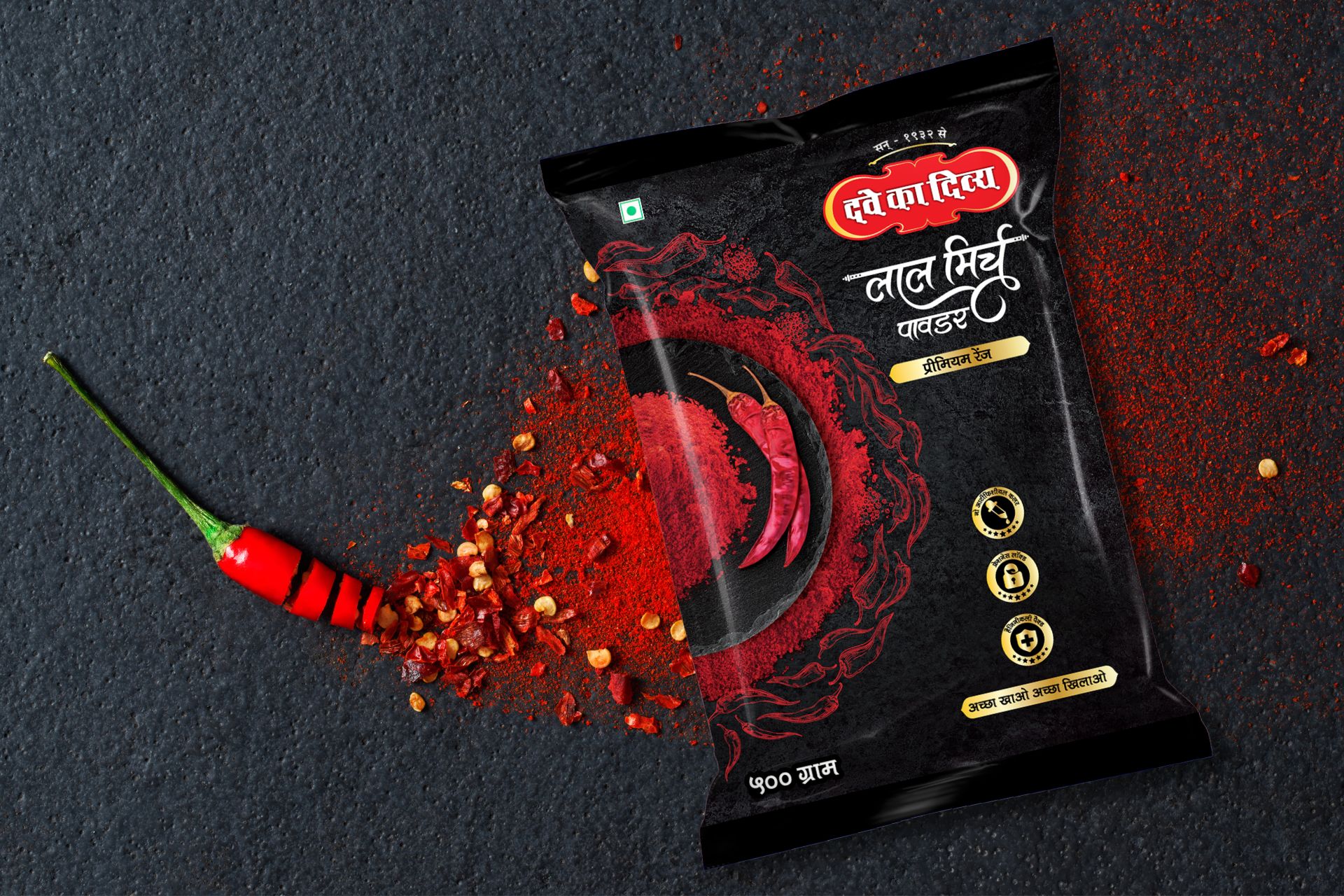
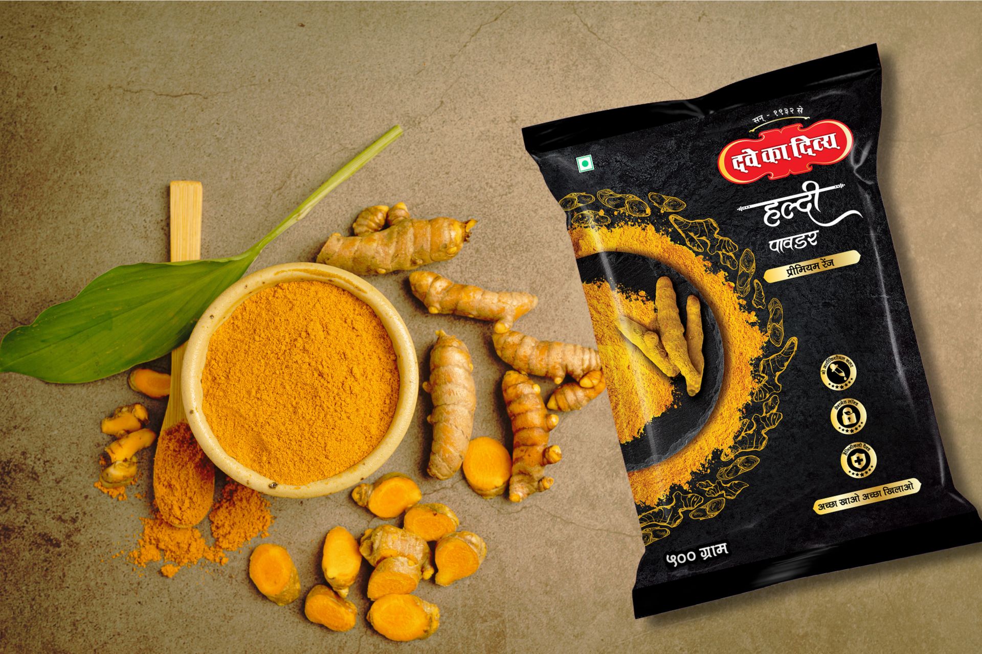
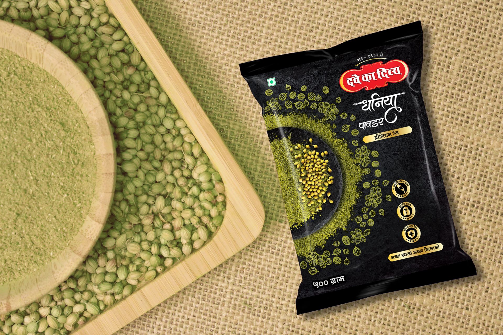
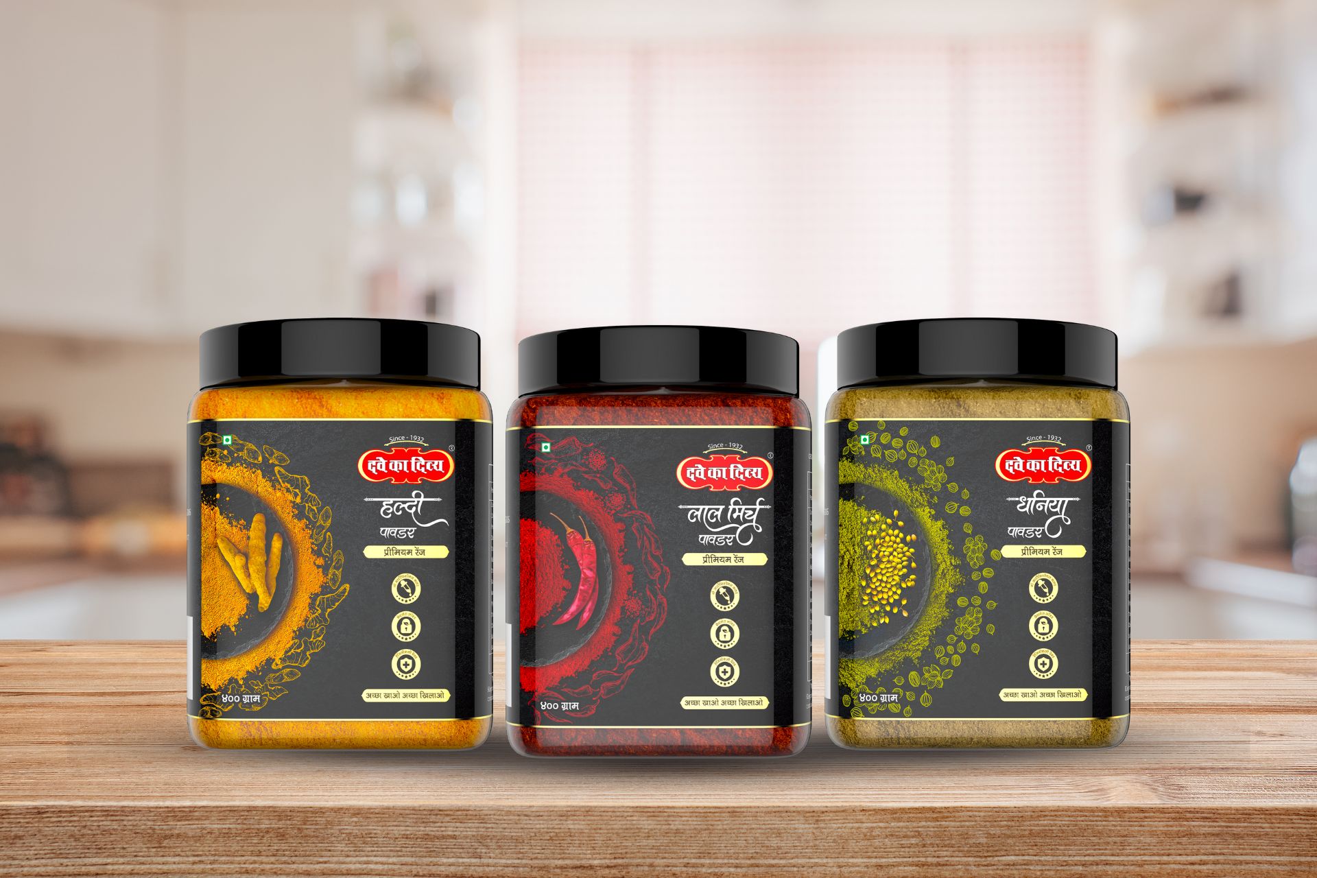
Dave Premium Spices approached us with a pressing challenge: to revamp their three best-selling ground spice products—Coriander, Turmeric, and Chilli—in a cluttered market saturated with outdated designs. The existing packaging was deemed archaic and failed to communicate the traditional essence of the spices. Our task was twofold: create a modern design that stands out amidst competition while preserving the authenticity and heritage of the category.
Scanning through the sea of competitors, we observed a common theme of unorganized packaging that lacked the natural charm associated with traditional spice grinding. It became evident that there was a significant gap in effectively conveying the essence of natural grounding in the packaging. Additionally, the need to communicate the unique selling proposition (USP) of the products to regional audiences further compounded the challenge.
Our solution was a meticulously crafted packaging design that seamlessly blended modernity with tradition, addressing the shortcomings of the existing market offerings. At the core of our approach was a commitment to honoring the age-old tradition of spice grinding while infusing a contemporary aesthetic. To capture the essence of traditional grinding techniques, we introduced a captivating top shot illustration on the packaging, serving as a visual homage to the heritage of spice preparation. Embracing the natural colors of the spices themselves, our design exuded a sense of raw authenticity and purity, setting it apart from the cluttered competition.
Recognizing the importance of connecting with regional audiences, we integrated mnemonic elements in the regional language, facilitating a deeper emotional connection with consumers. Our typography struck a delicate balance between modernity and legacy, reflecting the brand’s evolution while honoring its roots. The result was a packaging design that resonated with audiences across generations, successfully bridging the gap between tradition and innovation. By effectively communicating the USP of the products and celebrating the timeless art of spice grinding, our solution not only revitalized the brand but also positioned it as a trailblazer in the competitive ground spice market.
